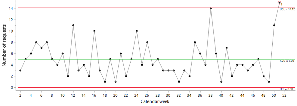
Figure 2: Control chart of the weekly request data
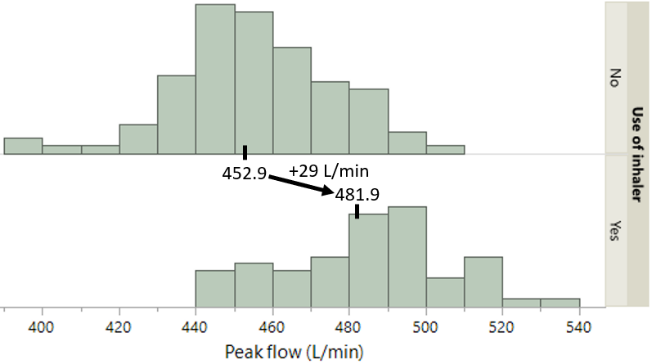
Figure 6 leaves no doubt: When using an inhaler, the result is higher peak flow values. This means that the airways in the lungs are open to a greater, and better, extent. Note that the “inhaler” data—right side of Figure 6—display predictable behavior (chart not shown), meaning that the upward shift was consistently sustained over weeks 28 to 36.
Listening to the voice of the process provides a lot more than “statistics,” which to some might seem of little consequence when it comes to what really matters in business. This voice provides insight to enable smarter work, not harder work.
By characterizing the system as predictable up to Week 50, we learn that any single week having up to, and including, 14 requests is “normal.” This insight debunks the idea that two people can satisfactorily handle all requests in each and every week of the year (assuming, as stated above, that one person can be expected to successfully manage up to four or five requests in a given week).
The high point at the right of the chart (Week 39) was the beginning of a Covid-19 illness. This ties in with what we were told: “Interestingly, according to a recent paper, resting heart rate tends to increase at the beginning of Covid, then drops down low, then eventually returns to normal.” Although weeks 40 and 41 are consistent with this hypothesis, we didn’t get the chance to see if resting heart rate could return to normal because the patient had a small heart attack, which coincides with the last two points on the chart (weeks 42 and 43).
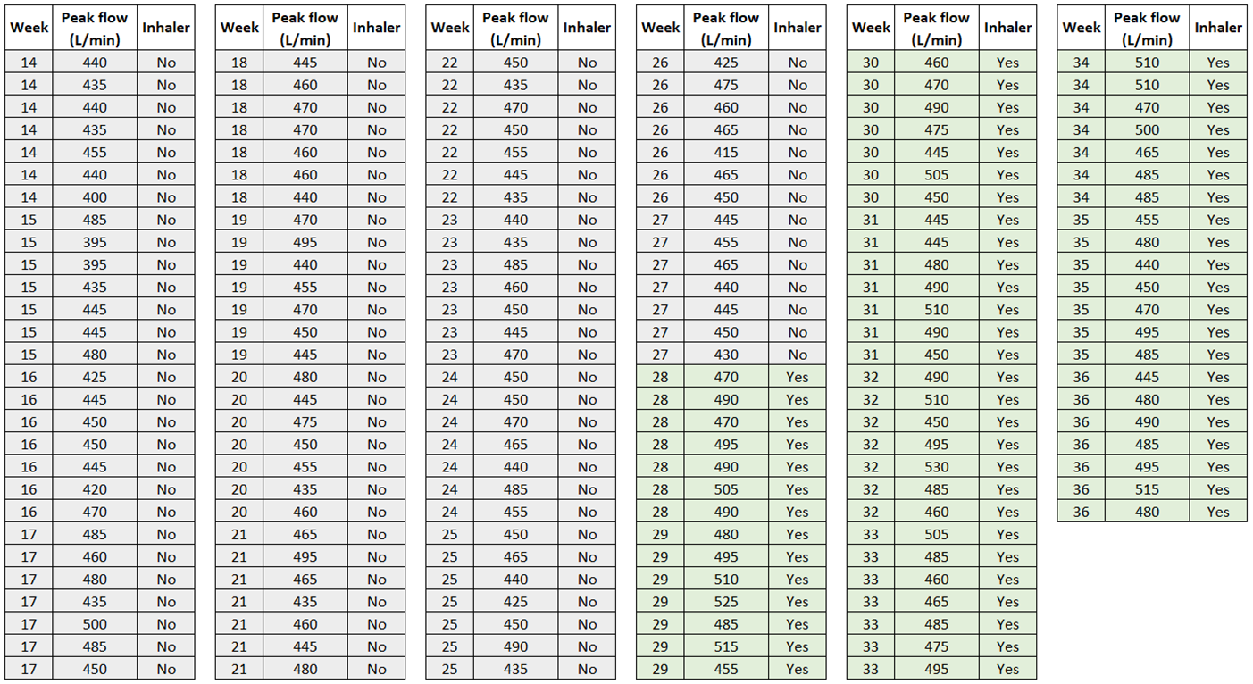
Figure 11: Peak flow data
Our PROMISE: Quality Digest only displays static ads that never overlay or cover up content. They never get in your way. They are there for you to read, or not.
Referring again to the “voice of the process,” what are these data trying to tell us? Excluding the special order, this process, or system, of daily sales displays predictable behavior, meaning that, unless things change, we can plan for:
• Daily sales to average about 57 items
• Routine sales for any single day to be anywhere in the range 12 to 101
Thanks,
Quality Digest
منبع: https://www.qualitydigest.com/inside/healthcare-article/spc-outside-manufacturing-012424.html
For the signals in weeks 7 and 15, some explanations were put forward—a holiday in Week 15, which is something nonroutine—but explanations as definitive as Covid-19 or a heart attack weren’t forthcoming. One weakness in the data around the time of the signals in weeks 7 and 15 was missing data. Another weakness was the long time lag—trying to find causes for events that happened close to one year earlier—which helps to explain the first rule of thumb mentioned above.

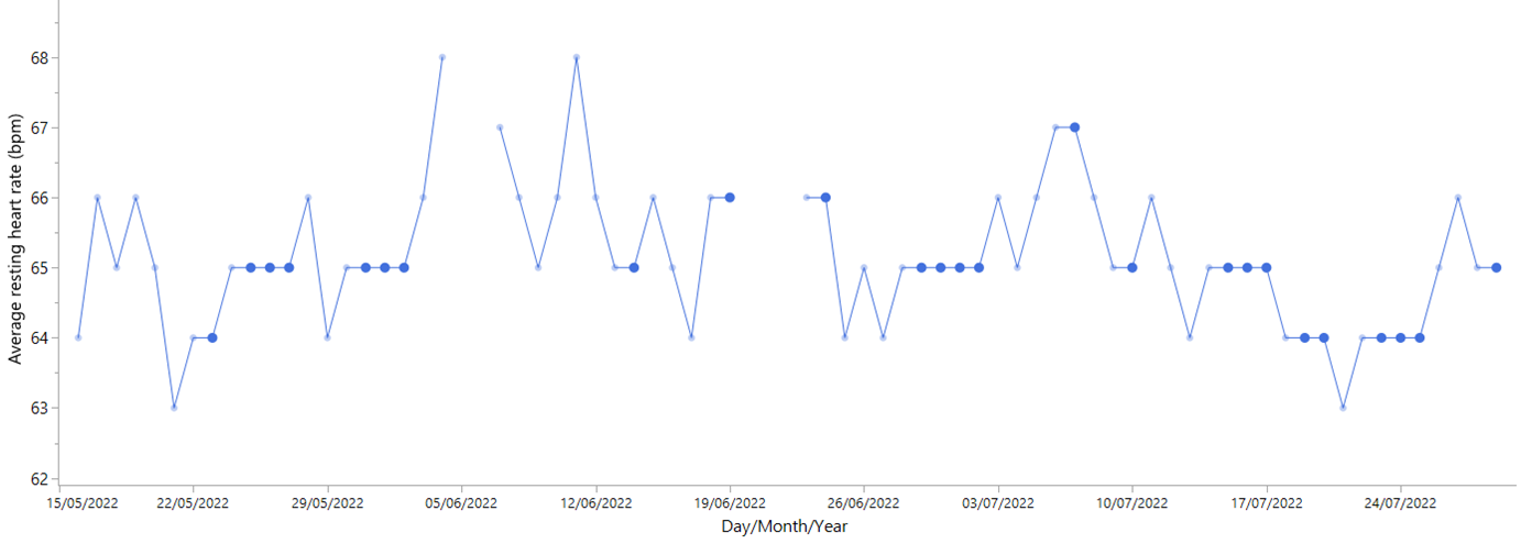
Figure 9: Illustration of successive values being equal
Our “noise filter” for these weekly averages is represented by the upper and lower control limits in Figure 10 of 61.94 to 68.09. We do find signals of detectably higher and lower resting heart rate:
• Higher heart rate: Weeks 7, 15, and 39 in 2023
• Lower heart rate: Weeks 41, 42, and 43 in 2023
Questions: How would you know if the number of weekly requests remains the same in the coming year? And why is the lower limit in Figure 2 set at zero? See our answers in the postscript.
Example 2: How many units?
While the voice of the process tells us that up to 101 units can be needed on a given “normal day,” the approach taken by Scott prefers running low on items and perhaps on the occasional day in the year even running out (see Part 3 of the empirical rule discussed in Example 1). Scott’s safeguard was a guy on duty until closing who had access to a small, easy-to-clean grinder to make the odd unit as needed.
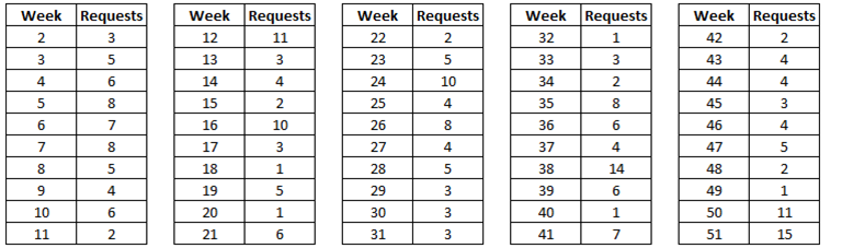
In a first discussion you’re told 1) to expect about five requests per week; and 2) that one person can manage up to four or five requests in a given week. Naturally, you wonder whether one person on duty per week might be sufficient. Nonetheless, you decide to take a look at some data before moving toward any final decision. You request data from the last calendar year, which are shown in Figure 1. (No requests were handled in weeks 1 and 52.)
However, someone has to pay for this content. And that’s where advertising comes in. Most people consider ads a nuisance, but they do serve a useful function besides allowing media companies to stay afloat. They keep you aware of new products and services relevant to your industry. All ads in Quality Digest apply directly to products and services that most of our readers need. You won’t see automobile or health supplement ads.
When the data are grouped by week, each subgroup consists of seven values. The traditional chart to use in this case is the average and range chart, which for the peak flow data, is shown in Figure 5. On the upper chart we find the weekly averages, and on the lower chart the weekly range (range = highest value – lowest value). The red limits bracket the range of anticipated “routine variation.”
If two people are assigned to handle support requests, we see that most of the time—at least two in every three weeks, which is Part 1 of the empirical rule—things ought to run smoothly with eight or fewer requests expected. Thus, high-quality customer support is seemingly ensured.
Here in Part 7 we move away from manufacturing and discuss SPC’s continued relevance, and potential, in areas such as planning and healthcare. In the examples that follow, we also aim to reinforce the importance of three key elements inherent in SPC:
1. Aim: What do you want to achieve? (Which questions should the data be helping you to answer?)
2. Context: You need to know what your data represent (i.e., when collected, how collected, conditions when collected, what might have influenced the results you got).
3. Thought: How to organize, use, and analyze the data to extract the needed insight and maximum information from them.
Example 1: Resource planning
Important context is that we have close to 500 data values and are looking back over one and one-half years. With so many data, we decided to group them by calendar week and use the weekly averages as individual values. The control chart using this approach is shown below in Figure 10. If we’d had less data, it’s unlikely we’d have taken this route, which again illustrates the importance of context and the need for careful thought.
Using the phrase “voice of the process,” what is Figure 2 trying to tell us?
Example 1:
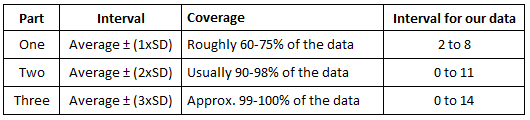
We asked, How would you know if the number of weekly requests remains the same in the coming year? We’d plot the count of weekly requests in the coming year on a control chart having the same limits as Figure 2. We’d check for a lack of consistency vs. the range of routine variation, which is counts between 0 and 14 and an average of 5. If a lack of consistency were found, the “resource plan” might need to change.
We also discussed and illustrated chunky-like data in Part 3 of our series when looking at high-frequency data. We explored the option of averaging values over 15-minute intervals and then control-charting these averages as individual values.
Following some preliminary analysis, including plots of the data using the individual values, it was decided to group the data by calendar week. (In Figure 11, the first column is calendar week.) In SPC, this takes us into the topic of rational subgrouping which “…has to do with organizing your data so that the chart will answer the important questions regarding your process.”
We now look at Fitbit data—a measurement of resting heart rate in beats per minute (bpm)—to see how such data can be effectively analyzed with an SPC “way of thinking.” Each value represents the average resting heart rate per day. The data cover roughly one and one-half years (May 2022 to October 2023). Of 527 days of potential measurement, there are 48 missing values; the reason for this is that the smart watch that provides the daily Fitbit data wasn’t worn on these days.
Notes:
• Another reason why so much was being made when Scott got involved was because the manager liked to make one prediction in the morning, make the product, clean the equipment, and that was it.
• Question: Similar to the situation described in Example 1, how would you go about deciding whether “things stay the same” during the weeks and months ahead? Also, why were the limits narrower in Figure 4?
Example 3: Asthma management
Why is the lower limit in Figure 2 set at zero? The technically correct lower limit is –4.1, but the number of requests in a given week can’t be negative.
Figure 1 adds more insight to the “about five requests per week” because the occurrence of requests as high as seven and eight during weeks 2–11 tells you straightaway that one person per week is unable to satisfy your customers’ needs and expectations.
This example is courtesy of Allen Scott, and it uses data on the daily sales of a meat product. Scott’s focus was on daily planning, i.e., How many units are needed on a daily basis? The aim was to plan better to minimize waste.
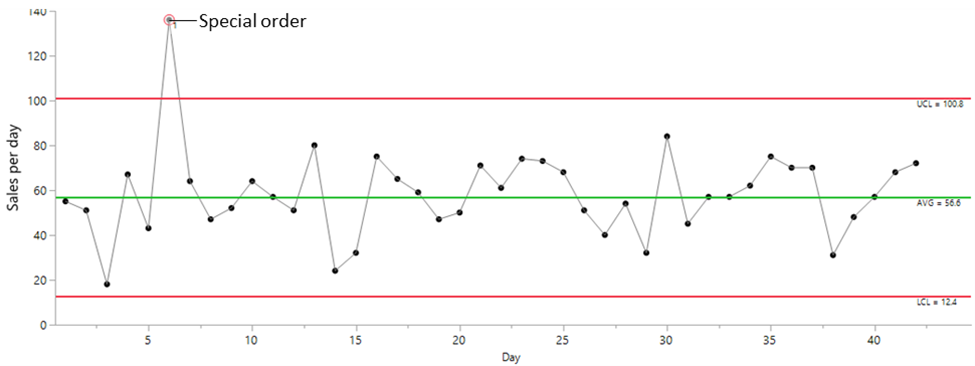
Figure 4: Control chart of the daily sales data (limits computed without the point above the upper limit)
Waste was thought to come primarily from having regularly made too many units. How could the company create a better match between what was made and what was sold? Not all excess units would be thrown away, but for those that could be sold, the packages would have to be rewrapped, reduced in price by 20% or more, and frozen. Moreover, manpower would be needed—another source of waste—for all this extra handling.
So please consider turning off your ad blocker for our site.
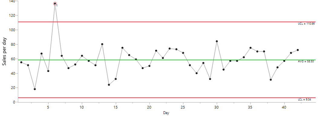
We can’t predict an exact number of sales per day but rather a range of possible sales. With a view to estimating this range, daily sales for close to one and one-half months were plotted on a control chart of individual values, as seen in Figure 3.
Example 3:
Peak flow data: Weeks 14 to 27 show peak flow without use of an inhaler. Weeks 28 and on show peak flow with the daily use of an inhaler.
Example 2:
• As with Example 1, to examine whether things stay the same or change, we’d collect new data and monitor them against the limits for expected routine variation found in Figure 4.
• The process limits in Figure 4 were narrower than those in Figure 3 because, for Figure 3’s limits, the high value—the special order—was associated with two high moving range values in the computation of the process standard deviation (or sigma). If further details are needed, put a note in the comments.
We also see that, about half the time, weeks will be “easy” with five or fewer requests to be expected.
To finalize a resource plan for the next year, we can use the empirical rule as explained by Donald J. Wheeler. With an average of close to 5 and a standard deviation of 3, we get the data below. (In Figure 2, the central line, which is the data average, is of value 5.0, and the 3-sigma distance is 14.12 – 5.0 = 9.12; hence, standard deviation = 9.12/3 ~ 3.)
The single signal in these data is the red-circled point way above the upper limit, which was found to be a special order for a large cookout; hence, the detectably different, and higher, number of sales. While special orders are desired and great for business, the voice of the process tells us that it’s valid to consider them as nonroutine events. As such, it’s reasonable to discount this high sales value in the computation of the limits. Figure 4 shows an updated chart, noting that the high point is still displayed but was excluded from the calculation of the limits. (For those with a keen eye, you’ll notice that the updated limits in Figure 4 are a little narrower.) See a note on this in the postscript.
Health Care
SPC Outside of Manufacturing
Part 7 of our series on statistical process control in the digital era
Following success with an inhaler, as well as avoiding cats and other risk factors, it was decided a couple of years later to run an inhaler-free period while continuing to measure peak flow daily. Without daily use of an inhaler, no specific symptoms of deterioration were felt (and cats were avoided). The only indicator of a potential worsening of the situation was a little drop in the peak flow data—the values were a little lower than a year earlier. In consultation with the doctor, it was decided to restart use of an inhaler to decide if, long-term, an inhaler was appropriate. A follow-up appointment was arranged for two to three months later. In the meantime, daily peak values continued to be collected.
What can be learned by listening to the voice of the process?
Importantly—and this is valid only because predictable behavior is demonstrated—the average number of daily sales can be trusted and relied upon (at least until a signal of unpredictability, or a lack of consistency, is found).
For the Fitbit data, one option to explore would be to express the average heart rate to a first decimal and not to a whole number (as we see in Figures 8 and 9).
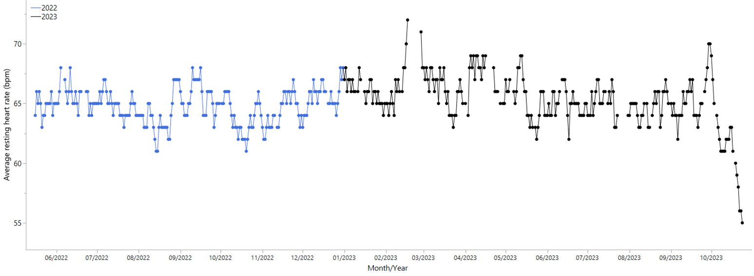
Figure 8: Time-series plot of the average resting heart rate data
This worker may indeed have worked hard, but for what benefit? Most of his work would end up being reworked! Thanks to charts like Figures 3 or 4, we could explain to the worker what makes most sense—i.e., producing fewer items—and discuss alternative tasks that might be needed to satisfy his hardworking mentality.
Although some data have an obvious way of being organized for a control chart, this isn’t always the case. Hence, a good idea is to start with a time-series plot of the data for a first interpretation (see Figure 8).
Two rules of thumb to consider when it comes to following up on control chart signals are:
• Start with the most recent signals first (because events are fresher in the mind).
• Focus on the biggest signals first (because they tend to offer the greatest payback).
A key question was: Is there a difference in peak flow when using the inhaler? As with most data, these can be looked at and analyzed in different ways (for example, as individual daily values or grouped by week). The thinking process alluded to at the start of this article focused on finding the simplest way to best answer the question of interest, with emphasis on an effective communication of the outcome. This points us in the direction of a “good graph.”
In this article we’ve illustrated and discussed the relevance of SPC outside of its more well-known uses in manufacturing. While our four examples touched on planning and healthcare, things don’t stop there. If you have data, and you want to learn from those data and apply those learnings to improve your processes, why not give SPC a go? Please share your thoughts and questions in the comments section.
Postscript
Where we struggle with a time-series plot is when filtering out the noise in the data to detect the signals. Control charts do this, and that is why they are so valuable. A signal in the Fitbit data means we find a detectably higher or lower heart rate that has a “findable cause.” In Figure 8, yes, we do see fluctuations in the data, but aside from the reasonably obvious downward trend at the very end of the record, when can we confidently state that resting heart rate is differently “high” and/or “low”?
Occasionally, however, things could get stretched—see the upper intervals for parts 2 and 3 of the empirical rule with values at 11 and 14, respectively—and customer support could fall below its usual high quality. This might happen something like two to three weeks per year. The “voice of the process” tells us that these “high” weeks must be anticipated, but when in the year isn’t foreseeable (i.e., random variation).
Published: Wednesday, January 24, 2024 – 12:03