Repeatedly, when my clients put the data from their automatic process-controllers on a simple XmR chart, they are surprised by two things. First, they are surprised to discover how their controller oscillates; and, second, they are surprised by the substantial increase in the process variation that results from those oscillations. In most cases their reaction has been to turn off the automatic process controller and return to manual control.
Of all the data analysis techniques we have invented, only the process behavior chart listens to the voice of the process and identifies exceptional variation within the data. This helps us to know when to look for the assignable causes of the exceptional variation. As we identify these uncontrolled assignable causes and make them part of the set of controlled factors, we’ll effectively reduce the process variation while gaining additional variables to use in operating on-target.
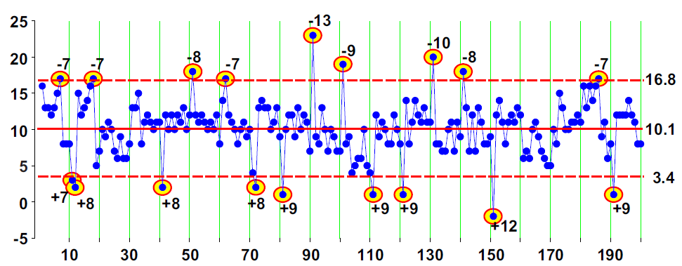
When we add the shifts of figure 2 to the values of figure 1, we have 20 process upsets. A change occurs on every tenth point, starting with point number 1 and continuing on to point number 191. Six of these shifts result in a net change of zero, and four shifts result in a net change of ±1.1 sigma, so that only 10 groups were actually shifted from their original values by ±2.2 sigma or more.
However, someone has to pay for this content. And that’s where advertising comes in. Most people consider ads a nuisance, but they do serve a useful function besides allowing media companies to stay afloat. They keep you aware of new products and services relevant to your industry. All ads in Quality Digest apply directly to products and services that most of our readers need. You won’t see automobile or health supplement ads.
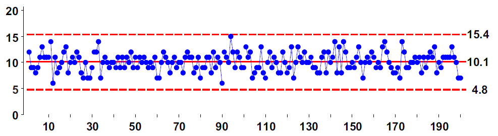
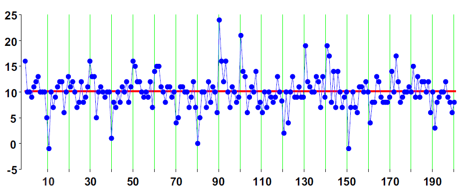
Figure 1: X chart for the 200 data of line 3
Our resulting example data set is shown on an X chart in figure 3 and is tabled in figure 12. The average value remains 10.11, but the average moving range is now 2.51. This results in limits that are 26% wider than those in figure 1. Despite these wider limits, nine of the 10 large shifts are detected by points outside the limits. Three more shifts are detected by runs beyond two sigma. So the X chart in figure 3 correctly identifies 12 of the 14 periods when the example data set was off target. This ability to get useful limits from bad data is what makes the process behavior chart such a robust technique.
Many articles and some textbooks describe process behavior charts as a manual technique for keeping a process on target. For example, in Norway the words used for SPC (statistical process control) translate as “statistical process steering.” Here, we’ll look at using a process behavior chart to steer a process and compare this use of the charts with other process adjustment techniques.
The second element (integral) will depend upon the sum of all the prior error terms, which I’ll denote here as Sum(E), where:
Only 14 of the 177 PID controllers (8%) did better than manually adjusting with a process behavior chart. One reason for this is that many sets of PID weights will result in an oscillating set of adjustments. With a process like the example data set that is subject to occasional upsets, these oscillations may never die out. This is why about one-third of the PID controllers increased the fraction nonconforming. It turns out that the art of tuning a PID controller is more complex than theory predicts simply because most processes are subject to unpredictable upsets. When your process is going on walkabout, it’s hard for your controller to fully stabilize.
As the name suggests, a PID controller makes adjustments based on the size of three elements. The first element (proportional) will depend upon the difference between the current value and the target value. This difference is known as the error for the current period. Letting the subscript t denote the current time period:
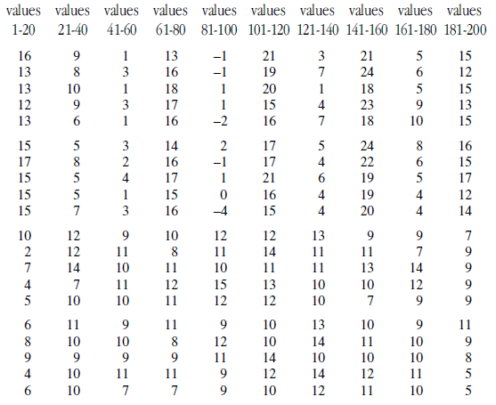
The data for our example data set shown in figure 3 are listed in figure 12 in time order by columns.
Sum of Error Terms up to time t = Sum(Et) = E1 + E2 + E3 +…+ Et-1 + Et
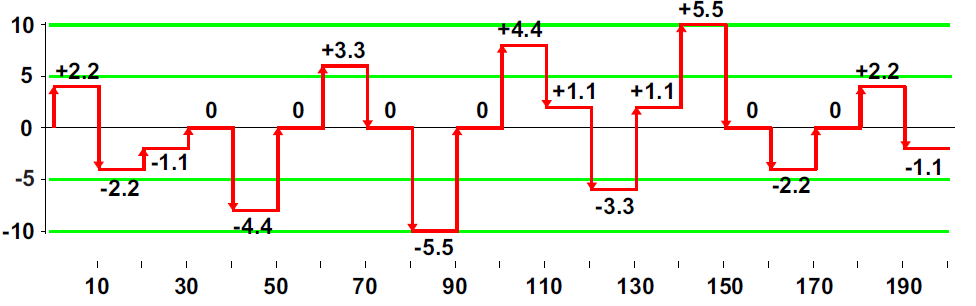
Figure 2: Shifts used to create signals within the data set
Adjustments are necessary because of variation. And the variation in your process outcomes doesn’t come from your controlled process inputs. Rather, it comes from those cause-and-effect relationships that you don’t control. This is why it’s a low-payback strategy to seek to reduce variation by experimenting with the controlled process inputs. To reduce process variation, and thereby reduce the need for adjustments, we must understand which of the uncontrolled causes have dominant effects upon our process. And this is exactly what the process behavior chart allows us to do.
In looking for a PID controller that might do better than Gibbs’ rule, I considered a total of 176 additional sets of PID weights. Of these, 61 actually increased the fraction nonconforming! The remaining 116 controllers reduced the fraction nonconforming by various amounts as shown in figure 9.
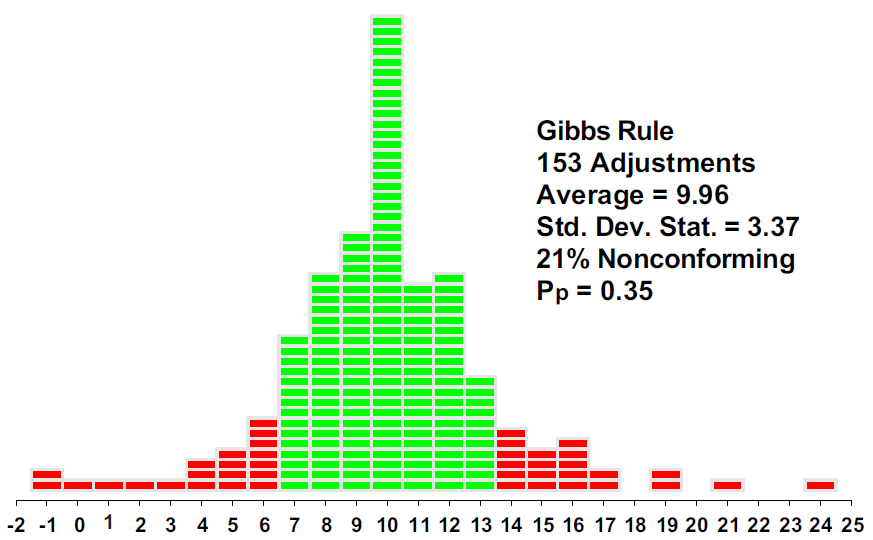
Instead of merely reacting to those shifts that are large enough to be of economic consequence, Gibbs’ rule reacted to almost everything, only failing to make an adjustment when the adjusted values happened to be equal to the target value (46 times out of 199 opportunities).
Other PID controllers
So please consider turning off your ad blocker for our site.
So, can we adjust our way to quality? Clearly, many different process-hyphen-controllers were found that reduced the fraction nonconforming for our example data set. But is this all there is?
Time after time, my clients have told me that as they learn how to operate their processes predictably, they find that the process variation has also been reduced to one-half, one-third, one-fourth, or one-fifth of what it was before. With these reductions in the process, variation capability soars, productivity increases, and the product quality improves.
But there is one more dot in figure 9 that has not yet been explained.
The sources of variation
ADJUSTMENTt+1 = – a Et – b Sum(Et) – c Delta(Et )
Thus, by virtue of background, training, and nomenclature, many people have come to think of a “process control” chart as simply a manual technique for maintaining the status quo. While it’s much more than this, we’ll examine how a process behavior chart functions as a process-hyphen-controller and compare it with other process adjustment techniques.
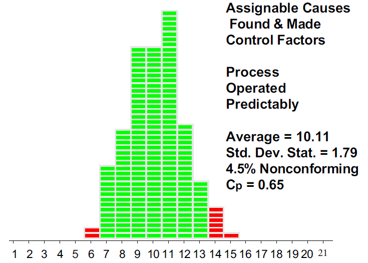
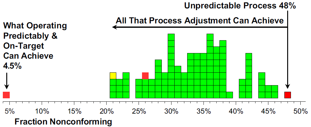
Operating this process predictably, rather than simply adjusting it after each upset, reduces the fraction nonconforming by an order of magnitude from 48% to 4.5%.
Process adjustment techniques are always reactive. They simply respond to what has already happened. They can do no other. At their best they can help to maintain the status quo. Yet sometimes they actually make things worse.
Six Sigma
Can We Adjust Our Way to Quality?
Process-hyphen-control illustrated
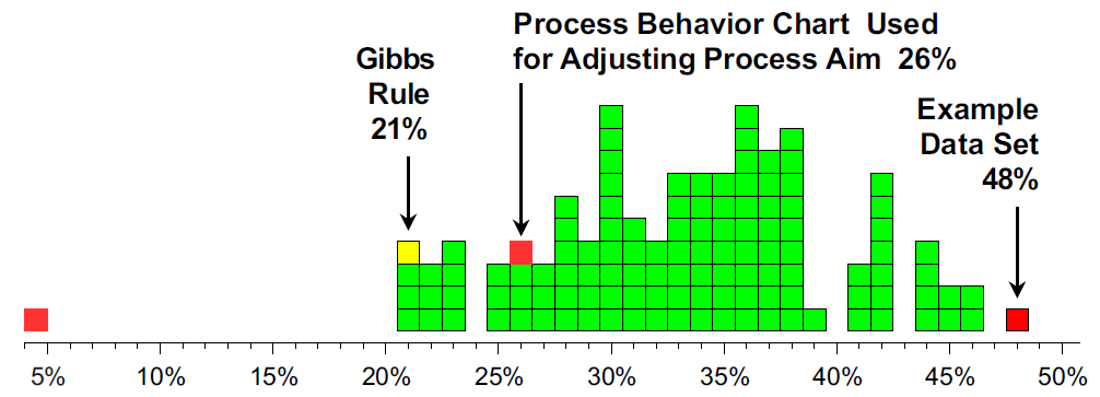
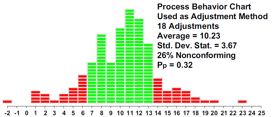
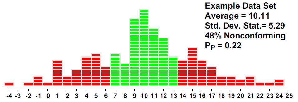
The histogram in figure 6 shows that by using the process behavior chart to adjust the process aim, we cut the fraction nonconforming down from 48% to 26%. By correctly identifying and adjusting for the changes in level, the process behavior chart improved the process outcomes while keeping the process centered near the target value. With a total of 18 adjustments, we have cut the fraction nonconforming in half.
PID controllers
To achieve full potential, we must not only adjust for process upsets but also find and control the causes of the upsets. And that’s why we’ll never be able to adjust our way to quality.
Appendix
where a, b, and c are the proportional, integral, and differential weights. The reasoning and constraints behind selecting these weights is beyond the scope of this article. Instead, we’ll look at how various PID controllers work with the example data set. We’ll begin with a simple proportional controller known as Gibbs’ rule.
Gibbs’ rule
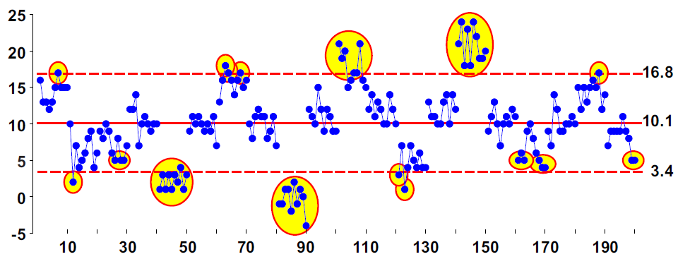
Here we make an adjustment to the process aim every time a point goes outside the limits. The cumulative nature of these adjustments means that we’ll have to process the values in our example data set in sequence. Using the limits of figure 3, we will interpret values of 17 or greater and values of 3 or smaller as signals of an upset. Whenever an upset is detected, an adjustment equal to the difference between the target value and the most recent value is made. In this way, we end up making 18 adjustments as shown in figure 5.
Given these three elements and following the observation at time period t, we can compute the adjustment to make before time period t+1 as:
The first technique we’ll consider will be using a process behavior chart as an adjustment technique.
Statistical process steering
Thanks,
Quality Digest